Yes, there is that sense of magic in great design–a kind of ephemeral “wow” factor as we experience looking at the night sky. We all have special places like this that we go back to when we can or carry around with us in our imaginations. If I knew how to consistently produce this effect, I’m not sure I would share it.
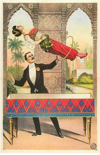
However, in this case we are taking “magic” in a more literal sense—a performance art which delights the audience through various forms of misdirection. Architectural purists may wish to stop reading here. “Honesty of materials” for example is an admirable design philosophy, say, when you can afford good honest materials. A quick review of all the ersatz offerings in trade magazines these days would suggest that this is not that often the case. The substitution of a look-alike is just the most obvious example of the magician’s art – Cheating 101.
I can already hear the gashing of teeth in the background. Fakery has always had a bad rap amongst the architecturally pious. This abhorrence may go all the way back to the ancient Greeks who were among the first to suggest that there is a “true” reality (noumenon) under the “apparent” reality (phenomenon), an “unseen real” beneath the “unreal seen.” Such as the steel studs under the vinyl siding. Of course the Greeks were just as guilty of “correcting” for visual problems, fattening up a column here or shortening up a proportion there just to get things to look “right.”
The subsequent history of western architecture to this day has been a pendulum swinging between practitioners who were primarily influenced by their concept of how a building should be rationally organized and those who cared mostly for how it looked. Thus we get the Renaissance order gradually giving way to the Baroque sensualism. Arid Modernism gave way to goofy Post-modernism, and so on and back again.
In design dominated by appearance, “smoke and mirrors” tends to get thrown around quite a bit, mostly in a pejorative sense. The dictionary defines this the phrase as “the obscuring or embellishing of the truth of a situation with misleading or irrelevant information.” Well that sounds like fun, doesn’t it?
We are certainly faced with occasional truths in our buildings that need a little obscuring or embellishing. No one would object to deflecting the visitor’s attention away from that 30-ton mechanical unit on the roof above the main entrance. If you want total honesty, visit a refinery. In the same way, it can be nice to embellish that plain concrete foundation with a decorative form liner.
Still, if we are going to be systematic about our chicanery (deception by artful subterfuge), it is important to have a working understanding of the perceptive abilities of our client or building user (hereafter referred to as “the mark”). Undisturbed, the mark inhabits a perception bubble that extends out about twenty feet or so ahead, a few feet to either side and focusses mostly downward upon the walking surface. Certainly something has to be quite prominent to be noticed above head height, and really stupendous to get the mark’s attention up on the floor above. Perhaps our ancestors were more concerned about twisting an ankle in a gopher hole or treading on a snake than they were colliding with a low branch. In any event, a great way to conceal an unfortunate feature is to put it up where we have to look for it or far off where it is of no concern.
Similarly, when scanning the walkway for tripping hazards or skunks, the mark’s eyes are drawn to the area of highest contrast. This too can be useful. Areas that were better left unnoticed should blend and be relatively featureless, while the diversion in the other direction can be visually popped out with color or tonal differences.
A basic knowledge of the three principles of camouflage in terms of figure (the ugly bit) and ground (everything else) is helpful here. Low visibility camouflage is the most familiar approach where the goal is to make the figure indistinguishable from the ground by matching it in color and texture. Think army camo. Dazzle camouflage does not attempt to make the figure invisible, but rather unintelligible—portions of the figure seem to blend in to the ground while others stand out. The figure is rendered incoherent. Think battleship. Countershading manipulates the apparent effects of light by darkening the upper portions and lightening the lower surfaces. This makes the offending object appear to be devoid of mass and volume. Think sandpiper. All three approaches can be useful to the aspiring magician.
Of course the most interesting things that can distract our mark are other people. That is why busy social spaces can get away with relative visual murder while quiet contemplative spaces can hardly stand a popped nail head. Choreographing the way people use a space can be the most effective way of making the elephant in the room disappear. Et voila!